Excel tips for data scientists - especially if they hate Excel
BLUF: Excel is a legit, powerful data science tool. Here’s a quick howto on some of the specific features that make it so.

I believe Excel is in the running for the single most important piece of software in the world, but it’s drastically undervalued — even scorned — in the data science community. Personally, I’m a late convert: after years of scoffing at it, slowly, year by year, shoulder-surf by shoulder-surf, I realised that Excel didn’t suck — I sucked at Excel.
Nowadays, it’s almost always my first stop for exploratory analytics when I get a new dataset or face a new problem. A lot of the time, to my surprise, it’s also my last stop. Here are some of the semi-hidden, simple, 1- or 2-click operations that, once I knew they existed, turned Excel from an object of mockery into a fully-fledged advanced data analytics tool.
The 7 Excel features you need to know
1: Pivot tables
AKA point-and-click GROUP BY. My vote for the best feature of Excel. When I’m starting a new problem, very often the first thing I’ll do is throw the data (or a sample) into a pivot table and click around. They’re great for basic descriptive analysis - getting an idea of class distributions, categorical ranges, simple stats of continuous ranges, finding null values, spotting typos on otherwise-similar category names, etc.
Their real power is answering questions like “what’s the average widget price by category by store by region?” or “how many students of each country took which classes and what were there average scores by class?”. You can get pretty wild with pivot tables, especially once you start cross-referencing data sheets/tables and so on, but I won’t go into huge detail — I’m sure there are whole online courses just about pivot tables. Here’s a quick sample:
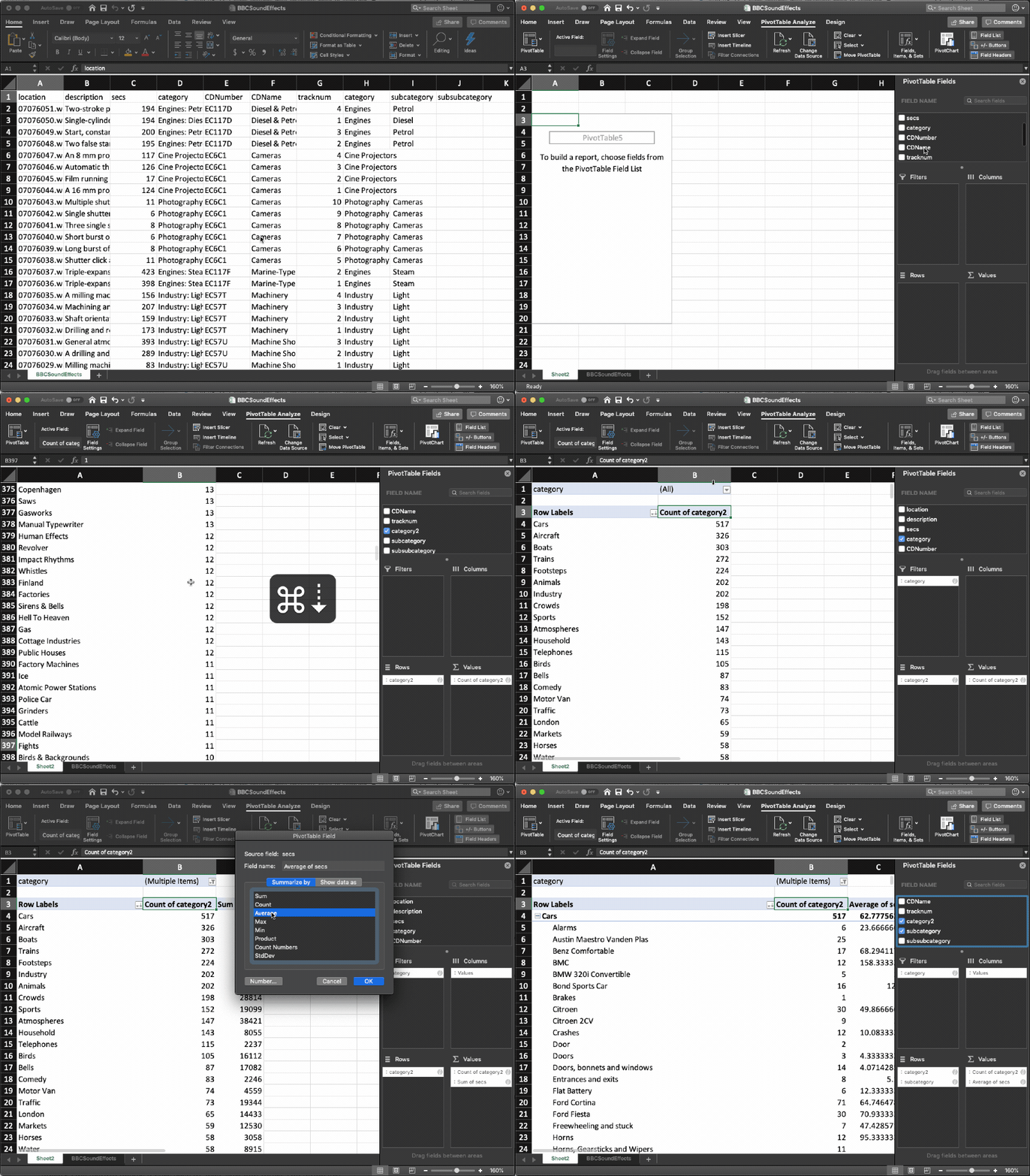
(As an aside, I’d bet money that 90% of day-to-day real-world “data science” could be done with Excel pivot tables. Scores of data analytics consulting groups would be put out of a job if every excel user in a bank or insurance company learned to use pivot tables properly.)
2: Sort and Filter
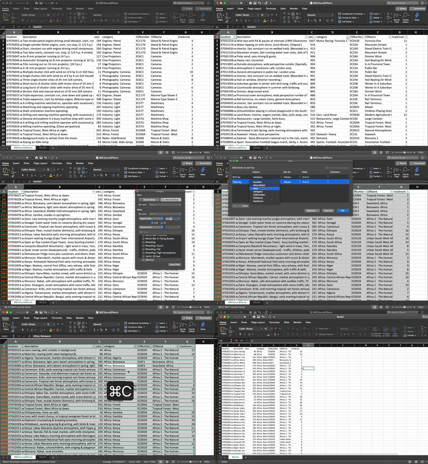
My second-favourite feature. Have a large dataset that you want to narrow down? This feature makes it very easy to, well, sort and filter! The filters are suprisingly powerful, supporting things like “starts with” and boolean combinations of filter criteria. It’s just a simple and effective way to e.g. remove all null values, narrow down to a broad category, sort by some combination of values, copy-paste to a new worksheet, and export.
3: Text to columns
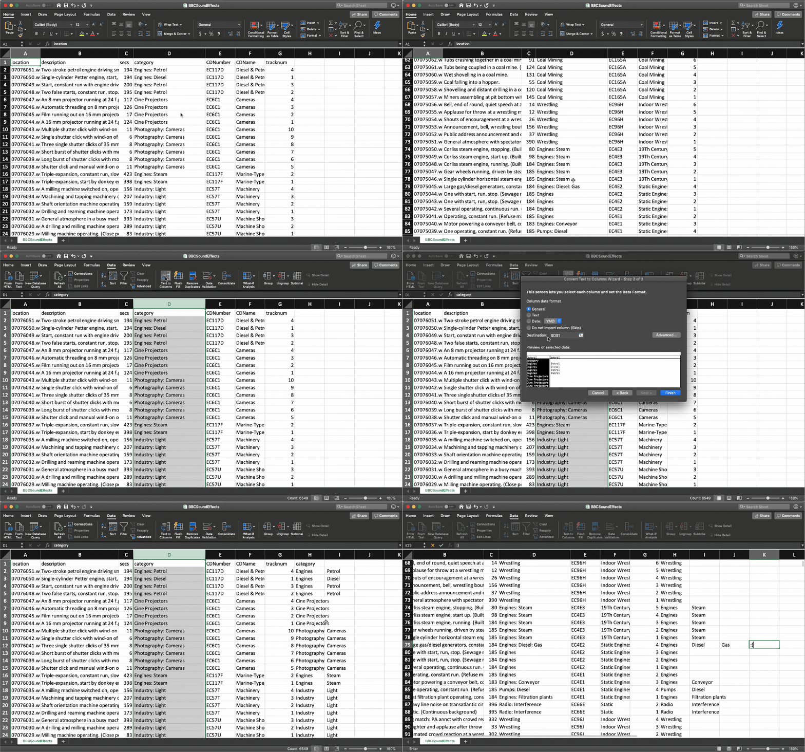
Somewhat hidden, this is really great for wrangling quasi-structured info into calculable, plottable structure. Particularly useful for correctly splitting internally-delimited cells1, it’s also good for creative manipulation of clipboard data.
If I have a gnarly quasi-structured string anywhere - in an email, word doc, or whatever — it’s often easier to twist the data around using a couple of text-to-columns manipulations2 than it is to pasting into a raw string in Python and using whatever string manipulations, .split, and .join (which is what I used to do).
4: Pasting HTML tables
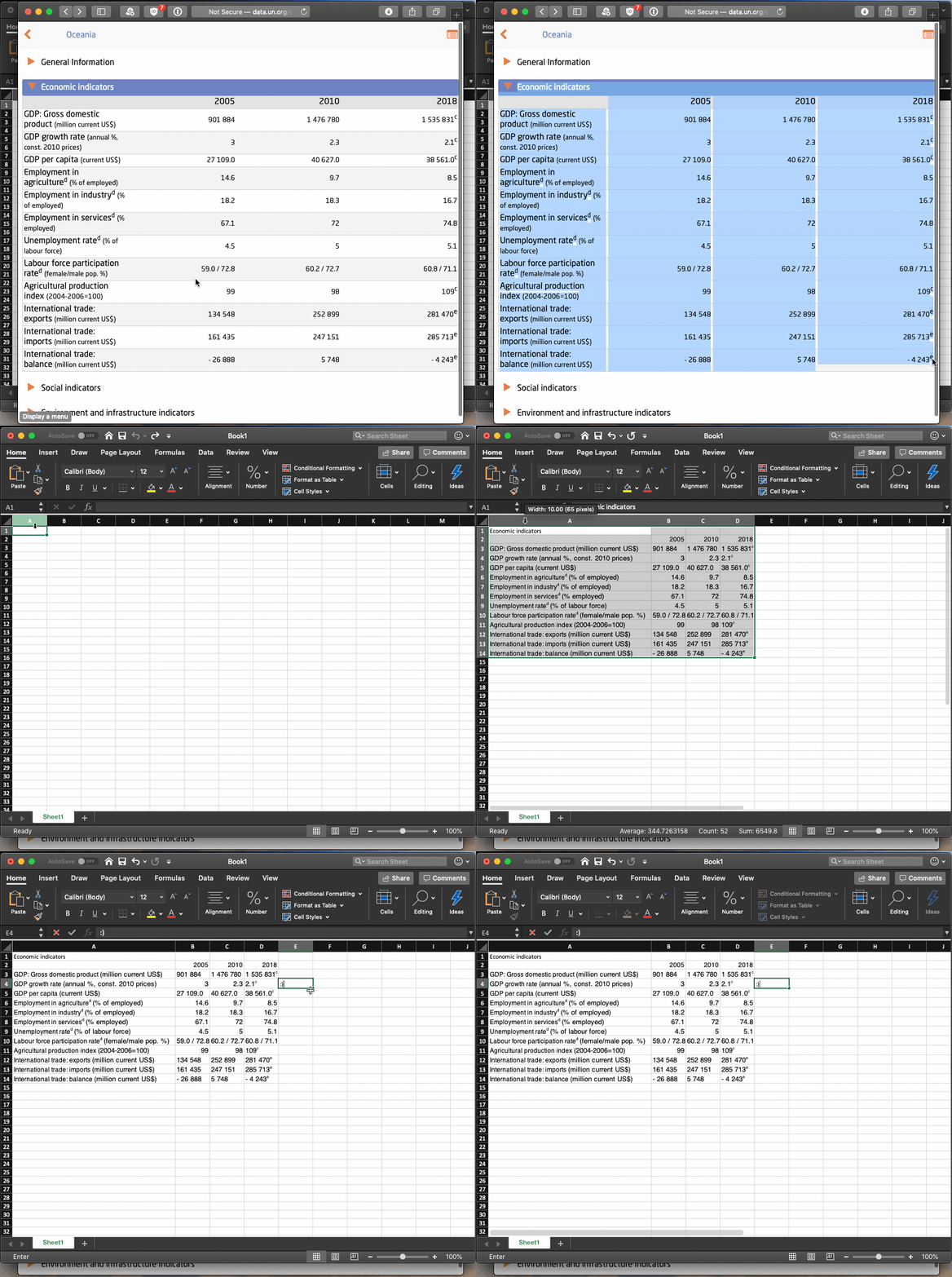
It doesn’t seem to tout this feature, but Excel has surprisingly robust “magic” support for understanding copied HTML tables. Often times it’s the fastest way to grab some data on a website and mess with it. Just select the table, ctrl/cmd+c, open a new worksheet in Excel, ctrl/cmd+v. Kazam! Magic! Didn’t work? Well, you were going to have to use BeautifulSoup anyway, at least this was worth a try. ;)
5: Calculations
Look, of course you & I both know that’s why spreadsheets were invented, but it’s still worth reminding you about! Excel is a bloody excellent calculator. Anything from converting times to milliseconds to performing multivariate regressions (and even a kind of gradient descent!) is possible in Excel. Slowly I’ve stopped launching the python repl to do random calculations and do them in Excel instead; particularly when you want to fiddle with variables & see the outcomes quickly.
Random plug - I’m also a big fan of Soulver. It’s a kind of notepad/spreadsheet hybrid that’s really useful for back-of-the-envelope calculations. I almost always have it open on my desktop and use it all the time on mobile for day-to-day ad-hoc calculations - budgets, currency conversions, measurement calculations, unit conversions, and so on. Give it a shot if you haven’t tried it.
6: Paste Special
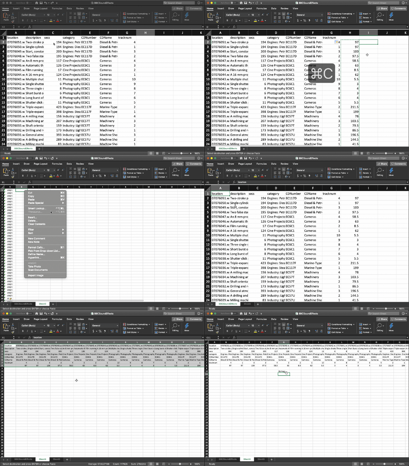
You probably already know this one, but it’s so useful I have to mention it. Once you’ve done all your filters, calculations and summaries, sometimes you want to copy & paste things to get values (rather than formulas), and to transpose.
7: Conditional formatting
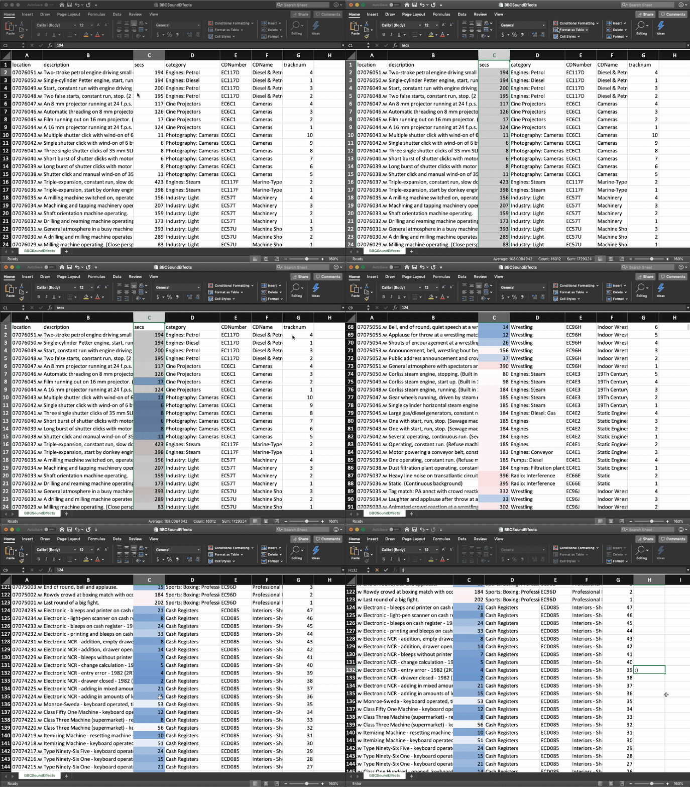
Only one button, not that hidden, but worth mentioning. It’s a nice way of getting a feel for your data while you’re exploring it.
Bonus: Don’t forget about charts!
For as much as we love matplotlib, ggplot2, Shiny web apps, Tableau dashboards and the like - sometimes you just want to throw together a bar chart. Excel’s charting library is not the best, but I find it’s often the fastest way to get a simple bare-bones chart up and running. Especially when used in conjunction with all of the above tricks. You can find yourself with an awful, quasi-structured table on a web page, and manipulate, pivot and calculate your way into a nice stacked bar chart in less time than it would take you to parse the data in a Jupyter notebook.
Of course, should you need to do the same analysis from the same source more than once, or track changes over time, or hand it off to anyone else to maintain, or have an auditable history of what you’ve done… then you switch to a real tool ;)
In conclusion
Learning about these features turned me into a born again Excel convert. After years of scoffing at it, convinced it was “just as easy and much more powerful” to load up a jupyter notebook & do some quick pandas + matplotlib to understand a new dataset, I can now admit that I was wrong. It’s now almost always my first stop when dealing with a new problem or dataset.
From here, you should watch Joel Spolsky’s canonical You Suck at Excel video for more tricks. Then look into making macros. Before you know it you’ll be painting landscapes or calculating your survival time when fleeing from a velociraptor.
